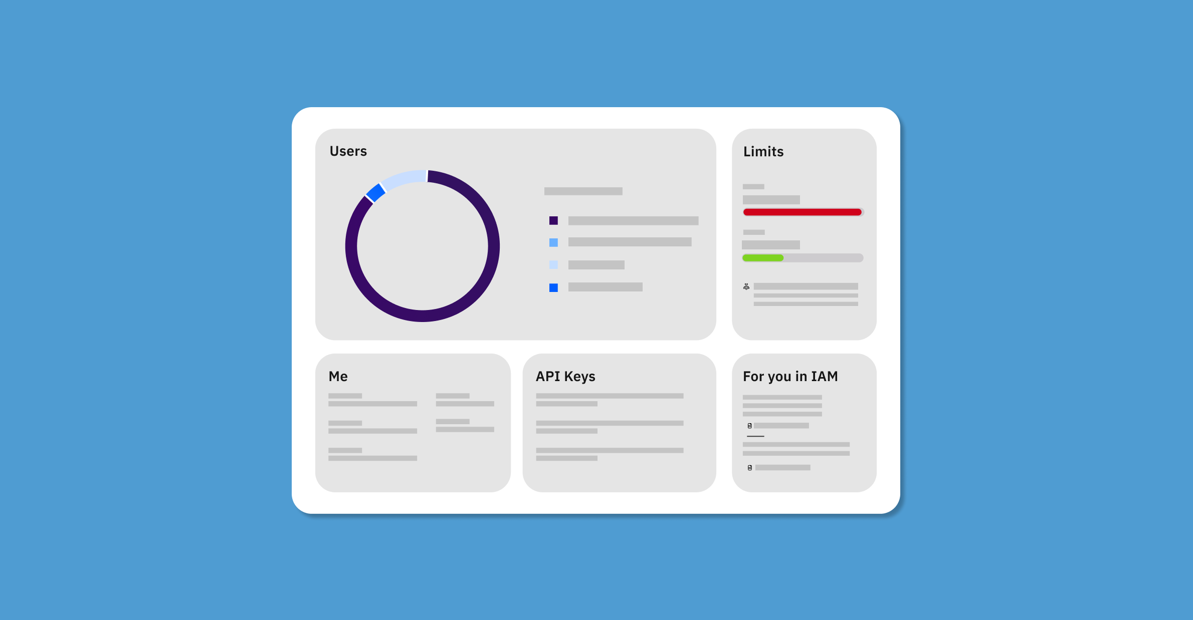
IAM Overview Dashboard
Role: UX/UI Designer
Skills: Innovation, Scalability, UX, UI, Collaboration, Concept Testing, Iteration
Team: 2 designers, 1 researcher, 2 front end developers, and many more cross team collaborators
1st Release: October 2020
Background
IBM’s Identity and Access Management team focuses on the security and safety of an organization’s Cloud Account. Its overview landing page was in need of a redesign. We had heard from users that it was “not useful” and “a waste of space”. Not only did we want to give the page a new and improved look with IBM’s newest design system, Carbon 10, but we also wanted to show our users a more useful data dashboard around their account.
The Solution
Create a new and improved landing page experience for our IAM users. A page that is both visually appealing and useful at a glance.
Ideation & Exploration
Project Constraints
Explorations
Every Project is Different
Unlike other more traditional formats to a design project, this one proved to have a different approach. We already knew the page was in need of a redesign. Additionally, as a team we had limited time and resources to enhance this page in a timely manner. *Note: Constraints included NO back end adjustment, just front end visuals for MVP.
Explorations
We didn’t know the specifics of what our users wanted, but from prior research and project constraints, we knew we had a strong starting point to begin ideating. Additionally, we knew we wanted to keep consistent with IBM’s Carbon Design System using the widget homepage approach. With this information, I designed multiple widgets in different formats to discuss with the team.
Below are examples of early explorations and ideations. Rather than focusing on the overall layout at first (though we had an idea), we focused on each widget, exploring different approaches for each topic.
Click to expand.
Click to expand.
After designing my first round of ideas, I took these concepts back to the design and development team to iterate and further improve the initial ideas. Each designer and developer gave feedback via zoom where it was noted or added directly onto the sketch file.
From there, I went back and consolidated our designs into 1-3 options per topic where we then conducted an unmoderated testing session with users getting feedback on their preferences, usefulness, and any other feedback they wanted to give.
Before going into testing, the team drafted a defined problem statement to drive the design initiative moving forward.
Problem Statement
IAM Users find the homepage useless and out of date. How might we improve the experience so that the information is useful at a glance and up to date with IBM’s Carbon Design System?
Testing and Final Designs
Unmoderated Session
Final layout
Team buy-in
Final Designs
Unmoderated Testing Session
Our research team then took the design and conducted unmoderated testing to get a wide range of feedback on usefulness, appeal, and more requests from the users.
The results can be viewed below.
Click to expand.
From testing, we were able to decipher which widgets proved the most useful to our users which allowed us to work on layout and hierarchy on the page. This testing method led by the research team was extremely fast and useful for me to move quickly with the designs. We didn’t need to do much synthesis from testing as the users we tested with grouped and synthesized for us.
Since we already had the details of each widget, I played around with small thumbnail drawings to understand the overall layout of the page. Below is the thumbnail that we ended up going with.
Team Buy-In
After testing with users and getting the foundational layout figured out, we took 3 final design options to the development team for feasibility and feedback. While we knew our constraints, we received feedback from users that added a bit more effort, but the pay off would be that much greater. We wanted to present the ideas to development, but also had 2 backups to keep the conversation open to iteration.
From there, as a greater team, we consolidated the options into one MVP that met our user needs and time constraint.
Final Designs
Below are the final designs that went into production October 2020.
For reference, below is the old overview page before the redesign.
What’s Next?
What I Learned
Next Steps
What I Learned
This project allowed me to flex more visual design work that I enjoy exploring and continuing to grow in. While it was quick, our team was still able to contribute back to the design system rather than just pulling from it. Go Team!
Next Steps
Our MVP goal was to get enhance the page’s use while also becoming visually compliant with the design system in such a short period of time. When the team is ready to expand, the design team recommended adding a more tailored experience to each individual based on their current data.


